Nathalia Lins' Portfolio Website
Nathalia Lins’ portfolio needed to be turned into more than just a gallery. This website turns it into a virtual showcase that elevates her personal brand.
My Roles: UX Research, UI Design, Product Design.
Tools Used: Figma, Figma Make, Figjam, Gemini
Problem
Nathalia is a professional print designer and illustrator navigating an oversaturated market. While she has a standard portfolio, it doesn’t provide the competitive edge or the immersive digital experience needed to highlight her specific expertise. She needs a digital solution that elevates her work from “just an image” to a professional brand identity.
Pain Points
- Platform Limitation: Her current work is hosted exclusively on Behance, limiting creative control and brand autonomy.
- Lack of Formal Presence: Absence of a dedicated, centralized channel to showcase her professional evolution.
- Client Acquisition Barriers: Need for a more sophisticated environment to attract high-tier clients and professional inquiries.
Solution
The proposed solution centers on a high-conversion landing page that bridges the gap between artistic talent and business growth through three key pillars:
- Strategic Brand Positioning: Translates Nathalia’s unique style into a cohesive digital identity, transforming a simple portfolio into a professional brand experience.
- Authority and Credibility: Establishes a “virtual showcase” that demonstrates industry expertise, fostering trust with high-end fashion collaborators and agencies.
- Streamlined Client Acquisition: Optimizes the user journey from initial discovery to professional inquiry, creating a seamless path for lead generation and client prospection.
Opportunities
- Elevated Brand Perception: Transcends standard social media portfolios to signal high-tier professional reliability
- Search Accessibility: Transitions the portfolio from a “passive” gallery to an “active” search-findable asset.
- Client Qualification: Strategically targets and attracts professional collaborators rather than casual inquiries.
- Specialization Showcase: Effectively communicates a unique value proposition within a specific creative niche.
- Unified Experience: Streamlines all brand assets and contact points into a single source.
Discovery
Competitor Analysis
To understand how Nathalia can best differentiate herself, I performed a comparative analysis of four independent designers and illustrators who share a similar professional profile to her. By evaluating professionals from both the international circuit and the Brazilian market, this audit focused on how these peers translate their artistic craft into a professional digital presence, highlighting the gap between a standard portfolio and a high-conversion “virtual showcase.”
To maintain privacy, competitor names have been anonymized.
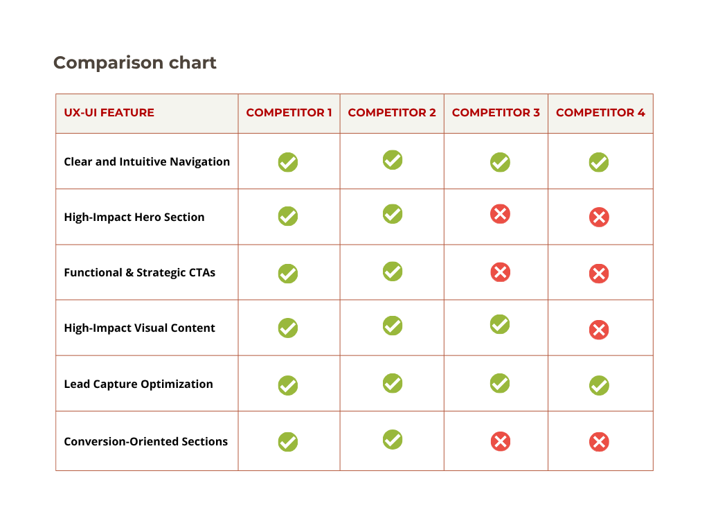
Pain Points
- Some sites (such as Competitors 2 and 3) redirect users to third-party stores. Without a clear “You are leaving this site” notification, this can disrupt the user’s flow and diminish brand trust.
- High-definition galleries often lead to heavy initial load times. This can be frustrating for recruiters or stakeholders accessing the site via mobile connections or under time constraints.
- Too much focus on digital products can dilute the personal brand, masking the designer’s core service offerings.
Gaps
- Process Storytelling: Highlighting manual sketches to elevate perceived value and artisanal authority.
- A streamlined menu architecture designed to reduce cognitive load and guide the user toward specific objectives.
- Distinct, section-specific CTAs to drive deeper exploration of the portfolio.
- Using “How to Work With Me” guides to demystify pricing and lower the barrier to entry for potential leads.
How can we leverage a curated landing page to solve the lack of professional authority and create a unified hub for lead generation and brand discovery?
Positioning
Elevate brand perception to reflect professional maturity and industry credibility.
Content Strategy
Showcase a refined selection of work to solidify her expertise and artistic specialization
Conversion Optimization
Drive business opportunities through integrated touchpoints, including CV downloads, lead capture forms, social media.
Ideation
Developing concepts
Guided by research, I iterated on design directions to align with the user needs and the client goals. Even within a fully digital workflow, the sketching phase was critical for rapid ideation. By using basic shapes and content blocks, I explored multiple layout variations to find the perfect balance between Nathalia’s professional narrative and her project showcase, ensuring a solid structural foundation before moving into high-fidelity design.
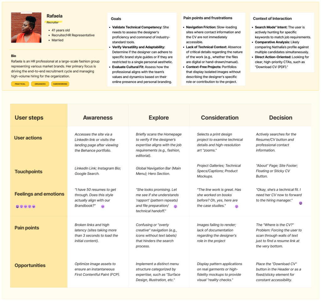
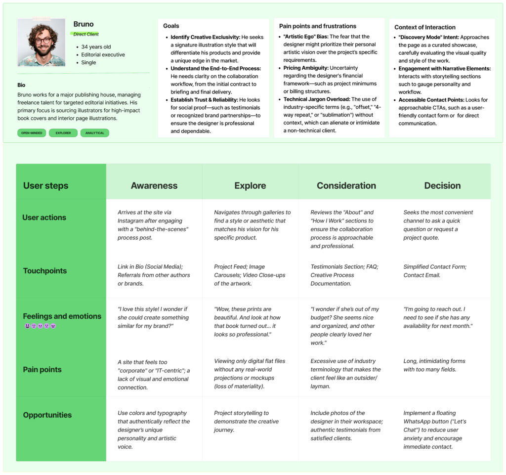
Defining personas and journey maps
To ensure the website portfolio met both corporate and creative expectations, I identified two distinct user profiles. While their goals differ, both are essential to the designer’s professional success.
Rafaela represents the high-pressure HR environment where speed and technical validation are essential, while Bruno represents the editorial and/or fashion markets, seeking a unique artistic partnership for specific projects.

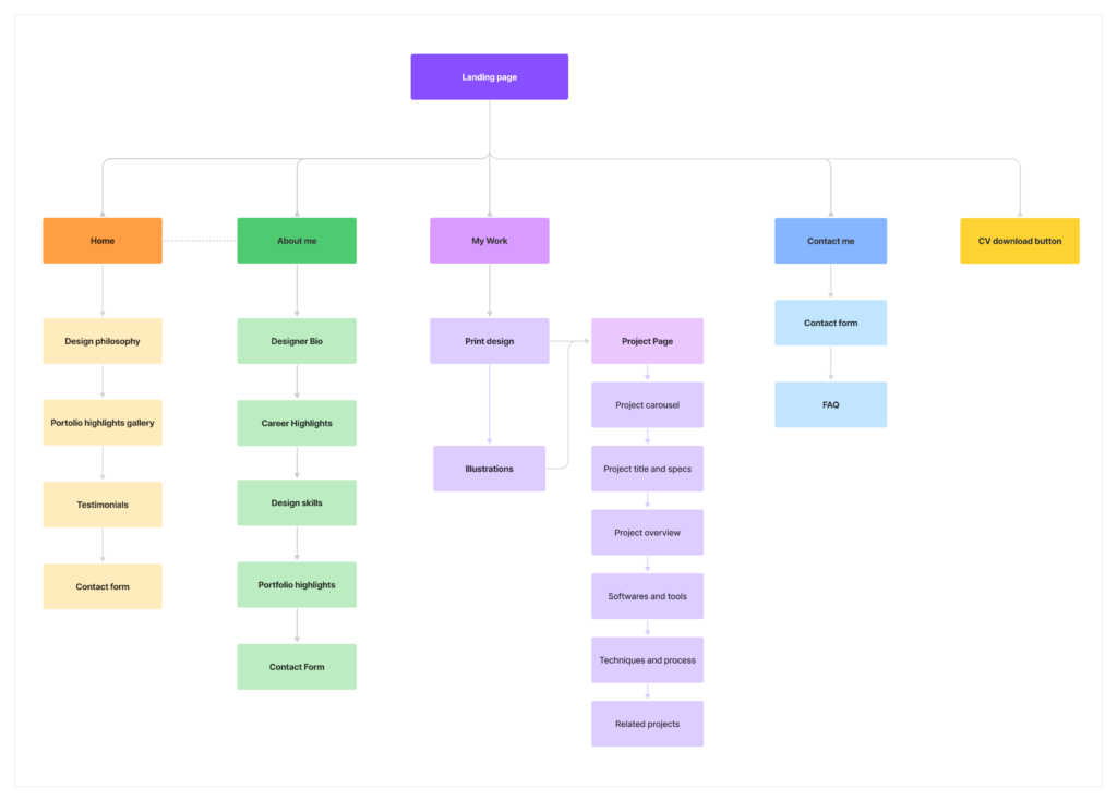
Information Architecture
The Information Architecture was designed to serve above two paths simultaneously. This map ensures that both the Recruiter’s need for speed and the Client’s desire for discovery are met with zero friction.
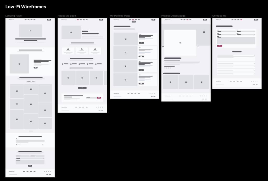
Wireframing
Coming up with the Mid-Fidelity Wireframes
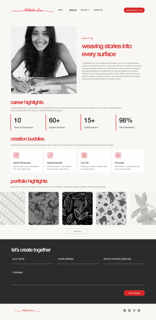
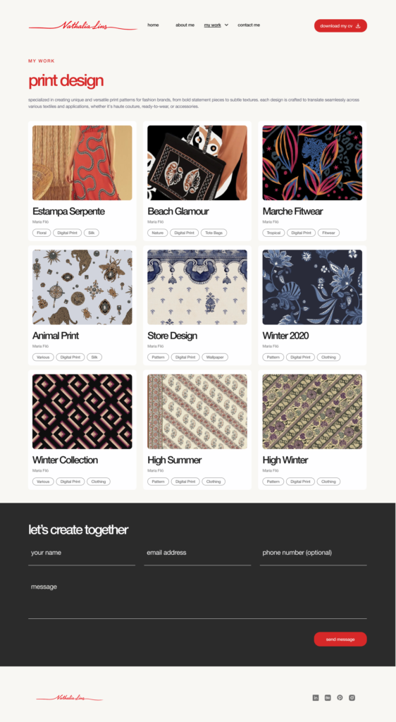
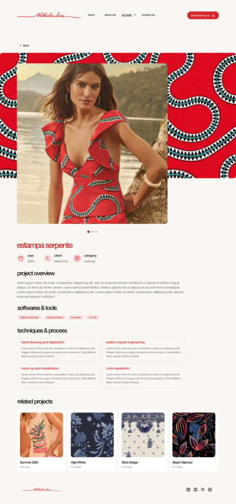
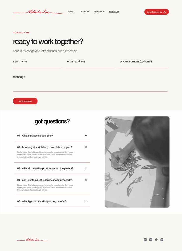
To create a curated experience that highlights her core expertise, my primary goal with these mid-fidelity wireframes was to map out the information architecture. I focused on strategically placing the most critical elements—balancing Nathalia’s professional experience and educational background with a clear, engaging presentation of her key projects.
Prototyping
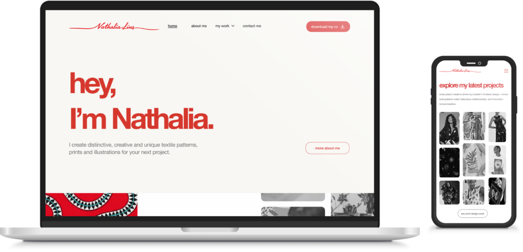
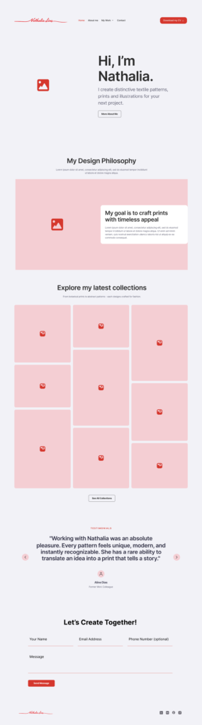
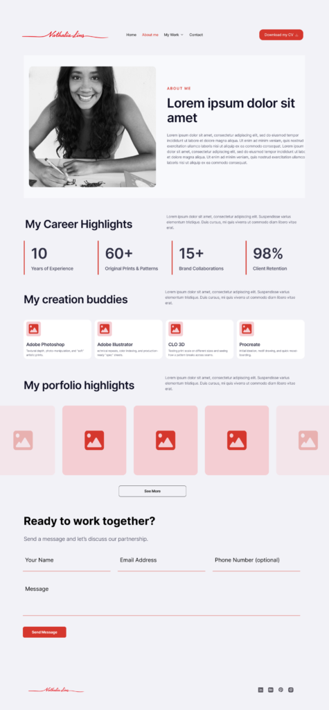
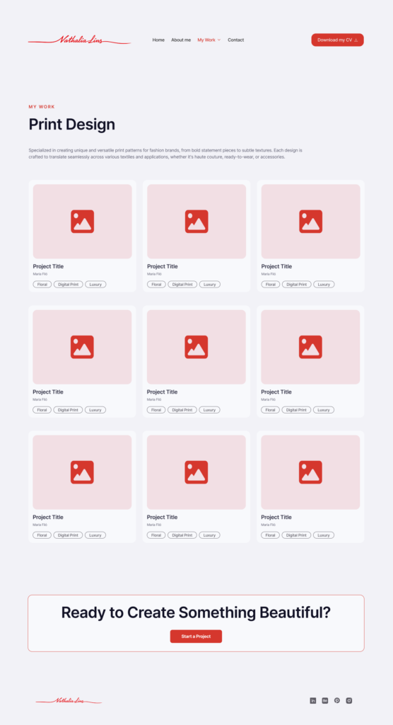
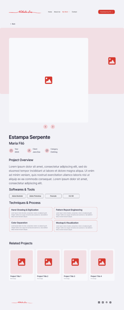
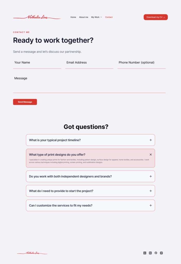
High-Fidelity Wireframes
After sharing the mid-fidelity designs with the client, I took her feedback and refined the details to create the high-fidelity wireframes. These screens show how the interactions work and how the final visual design came together.
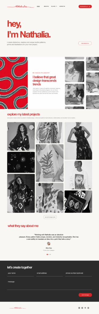
🔗 Explore the high-fidelity prototypes here.
Outcome
Project Status and Next Steps
The project was successfully finalized and received full client approval for the implementation phase. The proposed solution was validated as the strategic roadmap to unify Nathalia’s visual identity and optimize her professional narrative.
Following final approval, the focus shifts to technical hand-off and performance monitoring. We plan to analyze engagement metrics and time-on-page once the site is live, using these insights to continuously refine the user experience.
Feedback
Client Review
A key part of the UX process is ensuring the client’s vision is met. Nathalia’s feedback reflects the success of our collaborative approach and the clarity of the proposed solution.
Nathalia Lins
Illustrator and Print Textile Designer
I want to thank Isa for her incredible work. From day one, she was an exceptionally attentive designer, anticipating needs I hadn’t even realized yet. Following her process and understanding her design rationale was essential to the project's success. It was amazing to see my work from a new perspective through her prototypes; she managed to stay true to my style while maintaining her own unique creative voice. I now feel far more confident presenting my portfolio, and I can’t wait to see it go live.