Travel Tango
An admin dashboard case study about a travel platform that empowers travelers to create personalized trip itineraries while providing admins with tools to manage them.
My Roles: UX Research, UI Design, Product Design.
Problem
Admin users rely on a dashboard to review, assign, and manage trip itineraries, but the current workflow makes these tasks dense and unclear. This affects their productivity and the quality of the itineraries delivered to travelers.
User Problems
- Admins struggle to complete key actions
- Work overload affect their productivity
- The process is currently unintuitive and time-consuming
Solution
- Design the end-to-end itinerary management workflow.
- Make the workflow intuitive, user-friendly and efficient.
- Create an admin dashboard to support the main tasks.
Project Timeline

Discovery
Competitor Analysis
My first step was to conduct competitive/market research to understand the existing landscape. Since admin environments are often gated, I leveraged secondary research by user reviews and public design systems. This allowed me to identify recurring navigation pain points and established mental models. I took these common UI patterns and I ensured my dashboard’s architecture felt familiar to users.
Main Takeaways
- Each company’s core features: Like itinerary creation, actitivity and attraction planning, multi-destination, web access.
- Industry benchmarks: Focus on long-term engagement, strong conversion paths, and satisfaction metrics rather than daily usage alone.
- Shared capabilities and limitations: They share limitations in automation, real-time updates, and customization when itineraries get complex.
- Patterns and usability conventions: Chronological timelines, map-assisted planning, incremental inputs, and flexible editing.
- Exposed gaps and opportunities to refine the workflow: Travel Tango can stand out by moving from a passive planning tool to an active travel companion.
Ideation
First Sketches
With those insights from the competitors, I moved into ideation. I started by sketching early concepts to quickly explore a range of layout and user flow possibilities. This approach helped surface design opportunities, uncover potential usability challenges early, and informed the direction of subsequent wireframes and prototypes.
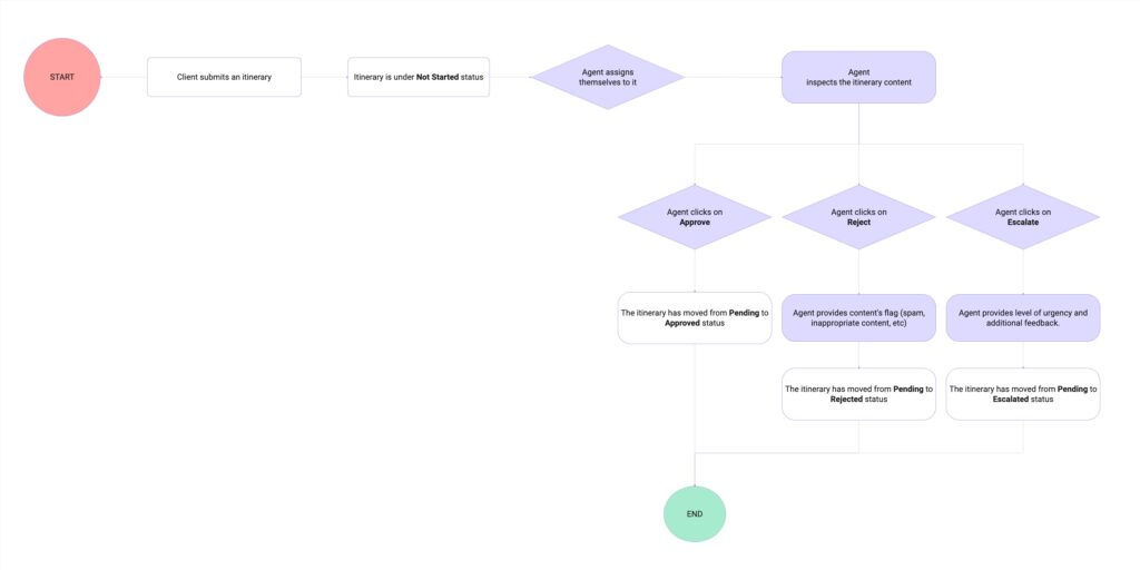
User Flow
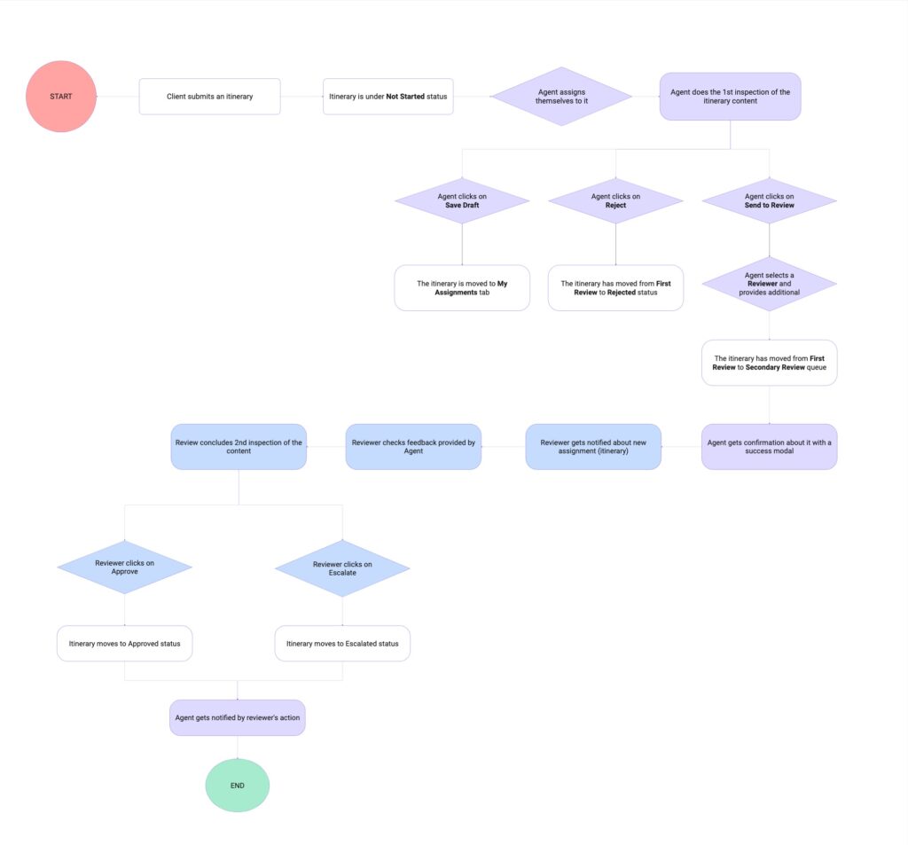
The drafted user flow maps the itinerary’s journey from submission onward, illustrating how the agent’s key actions—approving, rejecting, or escalating—directly impact its status at each stage. A key design consideration was empowering agents with the autonomy to provide justification when rejecting or escalating an itinerary, ensuring accountability, clarity, and smoother downstream communication.
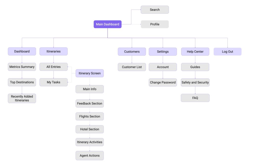
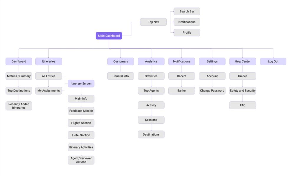
Information Architecture
A draft flowchart was created to map the information architecture, providing a clear view of how content, actions, and system states are structured. This allowed me to quickly validate hierarchy before moving into more detailed design and wireframing.
Prototyping
Mid-Fidelity Wireframes
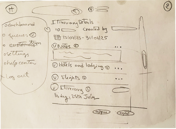
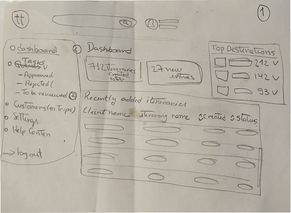
After validating the low-fidelity wireframes with the client, I moved to mid-fidelity wireframes. These focused on refining layout, content hierarchy, and key interactions, while demonstrating how the overall workflow functions from the admin user’s perspective.
Research
Usability Test
To validate the core flow before investing in detailed visual design, I conducted a quick usability test using mid-fidelity prototypes. The primary goal was to evaluate the clarity of navigation and the readability of the dashboard.
The test was conducted with three participants and followed a qualitative, exploratory approach. Participants were asked to complete a set of tasks using the prototypes while providing feedback on their experience.
Gains
- Users consistently gravitated toward the fastest path to complete the tasks.
- 67% of the participants find the tasks easy to complete.
- Participants appreciated the feedback provided after completing each task.
Pains
- Uncertainty about the clickable states of certain tags and table rows.
- 33% indicated lack of contrast that resulted in poor readability.
- Ambiguous table name lead to misinterpretation and second-guessing.
Challenge
⚠️ Unexpected Scope Change
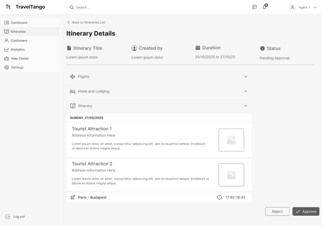
To enhance collaboration, the client decided that admins should assign itineraries to team members for a secondary review before approval. Although it caugh me by surprise, this change encouraged me to adapt to find a solution.
The goal was to keep the experience simple and straightforward while building on established patterns already in place. The flow mirrors existing actions to reduce cognitive load and avoid overwhelming the user, while still requiring a higher level of attention.
New Requirements
- Update flow to include the new steps: Admins require the ability to assign itineraries for peer review before final approval.
- A new feature: It should be integrated into the Approval & Feedback screen without overloading it or overwhelming the users.
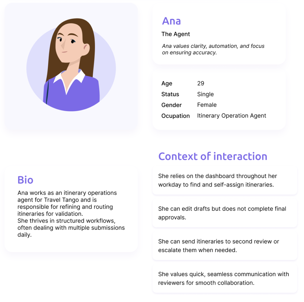
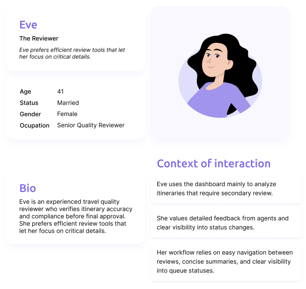
Personas
As the workflow evolved, it naturally split into two roles: agent and reviewer. To complete the action, the agent user only needs to assign the itinerary to a reviewer, provide a reason, and optionally leave a comment for the them. Together, these admin roles represent the personas for this case.
Updated User Flow and IA
The information architecture flowchart and user flow were updated to reflect the refined workflow and the introduction of the two admin roles. These updates clarified responsibilities and decision points across the system, ensuring that each role had access to the appropriate actions and information at the right stage of the process. Revisiting these artifacts helped validate the scalability of the solution and maintain consistency.
Prototyping
High-Fidelity Wireframes
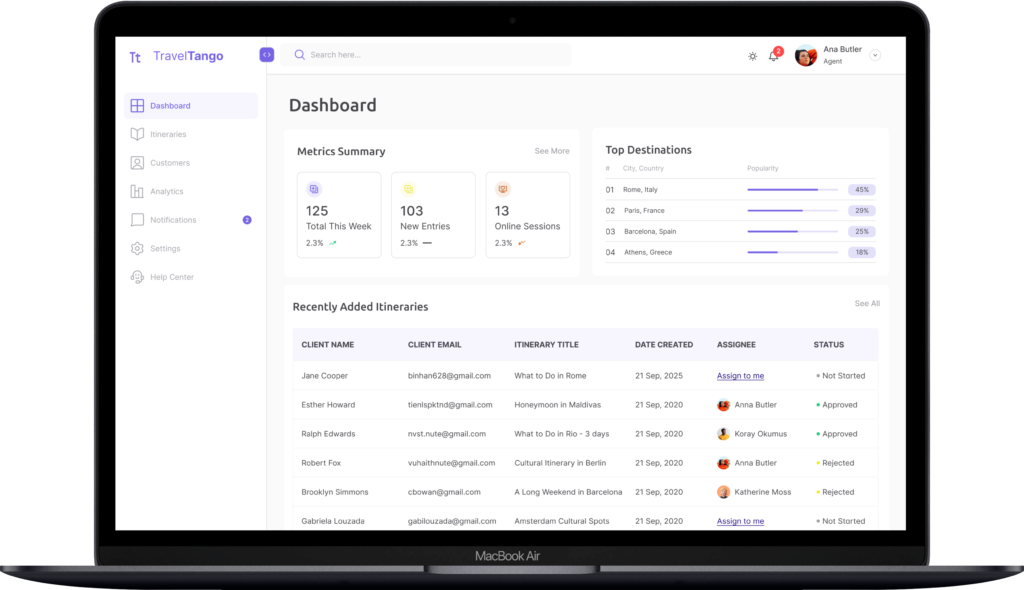
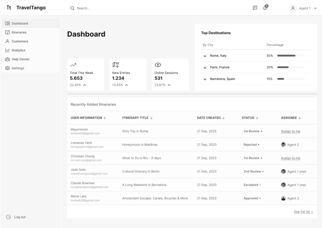
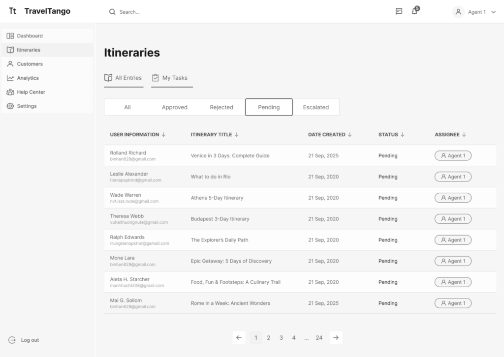
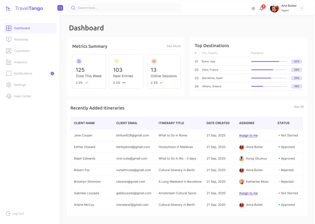
With insights from the initial usability testing and the structural updates introduced by the dual-role system, I transitioned to high-fidelity screens. These screens showcase the final visual design, refined interactions, and polished UI elements, illustrating how the dashboard looks and behaves in its final, production-ready form.
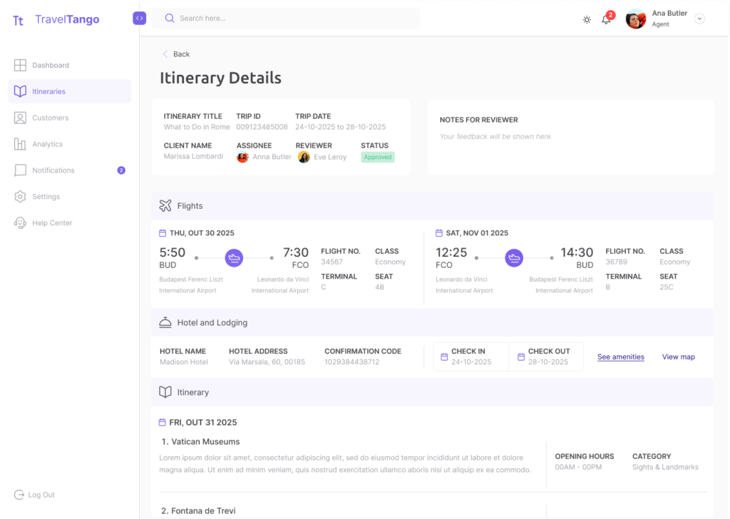
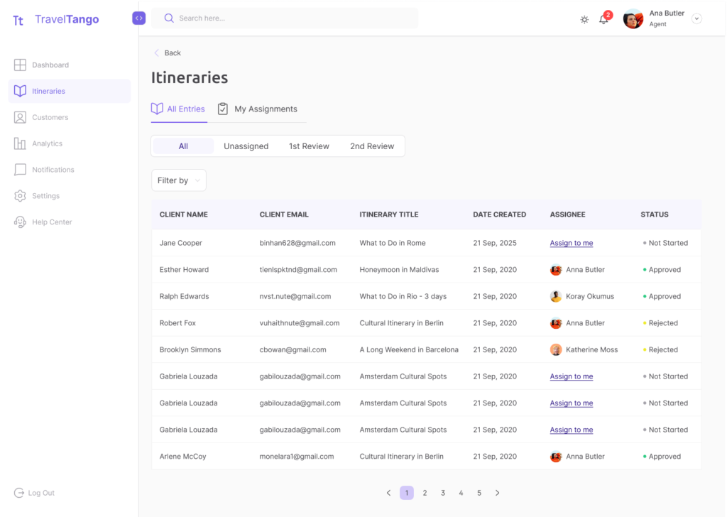
You can take a look at the high-fidelity prototypes here.
Testing
Measuring success
A second test was conducted not only to validate the high-fidelity screens, but also to confirm the effectiveness of the updated workflow. Users completed new tasks using the prototypes and it allowed me to identify any usability pain points or areas of confusion.
Takeaways
- 100% of users perceived tasks as quick, straightforward, and easy to complete.
- Strong visibility and fast updates made users feel in control and informed.
- Reinforced positive interaction by the familiarity with UI elements.
- Users sometimes second-guessed their next step, instead of the intended path.
Outcome
Project Learnings
This project was part of a UX/UI mentorship program led by Merve Koók, designed to simulate a real product lifecycle. Throughout the process, we met weekly to review progress, address questions, and plan next steps. Being involved in every stage (from user research and ideation to prototyping and usability testing) helped me build confidence in designing end-to-end experiences. It deepened my understanding of how each phase connects and how thoughtful, user-centered decisions evolve through iteration and feedback.
Feedback
Regular check-ins and reviews helped me identify blind spots early and iterate faster, ultimately improving the quality of the final solution. I can understand that it is crucial to detach your ego from your work and view feedback as an essential tool for translating critique into actionable iterations.
Process & Mindset
This project helped me move from designing based on assumptions to grounding decisions in user insights. I was able to move from assumptions to validation, being more confident and intentional on my design decisions.
Hard & Soft Skills
I leveraged mid- and high-fidelity testing to strip away assumptions and align the dashboard’s architecture with actual user mental models. This iterative process sharpened my ability to decode both user frustrations and stakeholder motivations, allowing me to synthesize diverse critiques into a single, cohesive design strategy.
Merve Kóok
Sr Product Designer & UX Quest Mentor
Working with Isadora throughout the Travel Tango project was a genuinely rewarding experience.
At the start of the project, she approached the problem with curiosity and care, and over time she grew into a much more confident and decisive designer. By experiencing the full end-to-end UX process - from research and problem framing to execution and storytelling - she developed a clear understanding of how individual decisions connect to the bigger picture. This clarity significantly strengthened both her design thinking and her self-confidence.
She became increasingly willing to tackle complex problems head-on, ask sharper questions, and stand behind her decisions. What I appreciated most was how open she was throughout the process: receptive to feedback, unafraid to challenge assumptions, and never hesitant to iterate. By the end of the project, she was no longer “playing small” - she communicated her ideas with confidence and presented her work with a strong sense of ownership.
Travel Tango showcases Isadora’s ability to translate research insights into structured user flows and thoughtful interface decisions. Her work reflects not only solid UX fundamentals, but also a growing maturity in how she frames problems, justifies solutions, and tells a coherent design story. I’m confident that Isadora is well-prepared to take on real-world product challenges, and I’m excited to see how she continues to grow as a product designer.