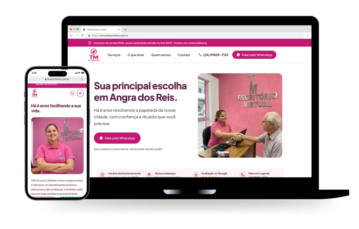
I led the design of a landing page for TM Escritório Virtual, a local service provider with 6 years of experience. The goal was to help users easily discover the business, understand the services offered, and get in touch through a simple, accessible, and trustworthy experience focused on an older audience.
My roles
UX/UI Design, Research
Tools
FigJam, Figma, Claude AI
Timeline
3 months
Year
2026
Category
Freelance Project
Overview
Goals
1. Understand user needs through research
Collect actionable and insightful customer feedback.
2. Improve service discoverability
Help users quickly find and understand the services offered.
3. Design for accessibility
Create an intuitive experience tailored to older adults and users with limited digital literacy.
4. Build trust and drive engagement
Establish credibility and make it easy for users to contact the business.
Problem Statement
How might we help people with limited digital literacy easily find the services they need, understand how the business can assist them, and confidently reach out for support?
Research
Competitor Analysis
Because the client offers a wide range of specialized services, they have a business advantage: no direct competitors, not even locally. So I took the liberty of running a competitive analysis that compared experiences rather than only offerings. The focus was:
“Who does this well, regardless of niche, and what can we learn from them?”
Based on this question, I selected four businesses offering services similar to those of my client. Not only do they operate in other locations, but they have also established a recognized online presence.
Using these four competitors as a benchmark, I created a matrix to compare their website experiences. The primary focus was to evaluate their main CTAs, how they communicate their booking processes and pricing, and how they establish trust and showcase social proof.
These UX elements were identified as particularly important for older adults, who benefit from clear direction and an online environment that conveys credibility and trust from the outset.
Similarities
Among copy shops and print service providers, WhatsApp is the primary communication channel across all businesses.
None offer pricing information, file uploads, or online booking.
Their websites primarily serve as digital storefronts and business cards.
Differences
Companies A and B provide more in-depth content, including detailed service descriptions, videos, and portfolios.
Company C has a more streamlined website.
Company D is the only one with a dedicated B2B (business-to-business) customer journey.
Opportunities
Opportunity
What we found
What to do
Transparent pricing
Almost none of the websites display prices. Company A lists photocopying services in a directory starting at R$0.06.
Publish a price list and display “starting at” prices for the most popular services.
WhatsApp contact
WhatsApp is how these businesses actually talk to customers, yet none of their websites make it the main call to action.
Make WhatsApp the main channel for contact and customer inquiries.
Research with the Client’s Existing Customers
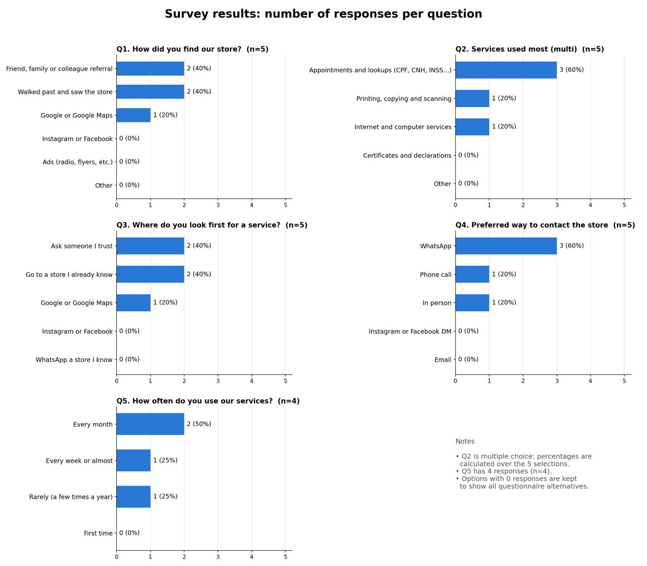
Having regular customers visit the business in person gave us an advantage when gathering feedback. In addition to asking the client to document the most common questions customers bring up (such as opening hours, pricing, required documents, and turnaround times), I also conducted brief interviews with five customers.
The questionnaire consisted of standardized, closed-ended questions. My main goal was to measure behavioral patterns, identify recurring trends, and test hypotheses. This approach also aimed to respect customers’ time by keeping the research brief, straightforward, and focused on the key questions.
Key Takeaways
Word of mouth and physical visibility drive discovery. Most customers found the store through a referral or by walking past. Few came through Google, and none through social media or ads.
Government-related services are the main draw. Appointments and lookups (CPF, CNH, INSS) were the most used services.
Trust matters when choosing a provider. Most customers ask someone they trust or go to a store they already know before searching online.
WhatsApp is the preferred channel. It was the most chosen way to contact the store. Email and social media direct messages were not chosen at all.
The customer base is loyal. Most customers use the services weekly or monthly, and there were no first-time users.
Personas and Empathy Maps
This research gave me the opportunity to develop two user personas for the product, representing two distinct age groups: an older adult woman and her adult daughter. Keeping in mind their different perspectives and approaches to the service, I also created two empathy maps.
Background
Maria is a retired widow who lives alone in the city center. She receives her INSS pension and manages her own bills, but often asks her son or a neighbor for help with anything involving a computer. She has been visiting the shop in person for years: initially to photocopy documents, and later to file her income tax return and pay the annual vehicle tax (IPVA) for the car she still owns, even though she rarely drives.
Online behavior
Owns a basic Android smartphone given to her by her son.
Uses WhatsApp daily to keep up with family and church groups, and knows how to take photos and send voice messages.
Doesn’t use banking apps or perform complex Google searches. When she needs to look something up, she usually asks for help or uses voice search.
Has heard about online scams and worries about “clicking on the wrong thing.”
Goals
Handle paperwork, such as income tax returns and vehicle taxes, without complications or needing to understand technology.
Know in advance which documents to bring, avoiding unnecessary trips back home.
Receive patient, respectful service.
Frustrations
Websites with small text and buttons that are difficult to tap.
Technical terms she doesn’t understand, such as “upload,” “sign up,” and “log in.”
Fear of entering incorrect information and facing negative consequences.
Long waits on the phone without getting an answer.
Opportunities
Make it easy to confirm the address, opening hours, and phone number before leaving home.
Clearly explain which documents are required for each service, using simple language.
Provide a large, clearly labeled WhatsApp button so she can send a voice message instead of typing.
Background
Rosangela is Maria’s daughter and lives in the same city. She works regular business hours and has little free time. She is the person who “gets things done” for the family: scheduling her mother’s medical appointments, handling paperwork, and researching services before recommending them. She has helped her mother file her income tax return and pay her vehicle tax (IPVA) in previous years. This year, she wants to make sure the business her mother regularly visits is trustworthy and up to date.
Online behavior
Uses her smartphone throughout the day and is comfortable with the internet, social media, and Google Maps.
Before recommending a service, she checks Google reviews and asks for recommendations in local Facebook or WhatsApp groups.
Often schedules appointments for her mother by phone or WhatsApp, since her mother tends to avoid fully digital processes.
Values speed and efficiency. If a website takes too long to load or lacks the information she needs, she gives up and calls directly or looks for another option.
Goals
Quickly confirm that the business is still operating and offers the service she needs, such as income tax preparation.
Check reviews and credibility before sending her mother there alone.
Find clear, practical information about approximate prices, required documents, opening hours, and whether an appointment is necessary.
Frustrations
Outdated websites with incorrect opening hours or unanswered phone calls.
Little or no presence on Google, whether due to poor search visibility or a lack of reviews.
Having to call to get basic information that could easily be available on the website.
Feeling uncertain about whether the business is trustworthy because of a lack of clear information online.
Opportunities
An “About Us” section featuring the company’s background and real photos to build trust before the first visit.
A straightforward FAQ covering required documents, turnaround times, and approximate prices, making it easy for her to share information with her mother or decide whether the service is worth pursuing.
A quick-contact WhatsApp button that allows her to arrange services on her mother’s behalf, if needed.
Empathy Maps
Click an image to zoom in.
Information Architecture
Testing
Testing the Wireframes
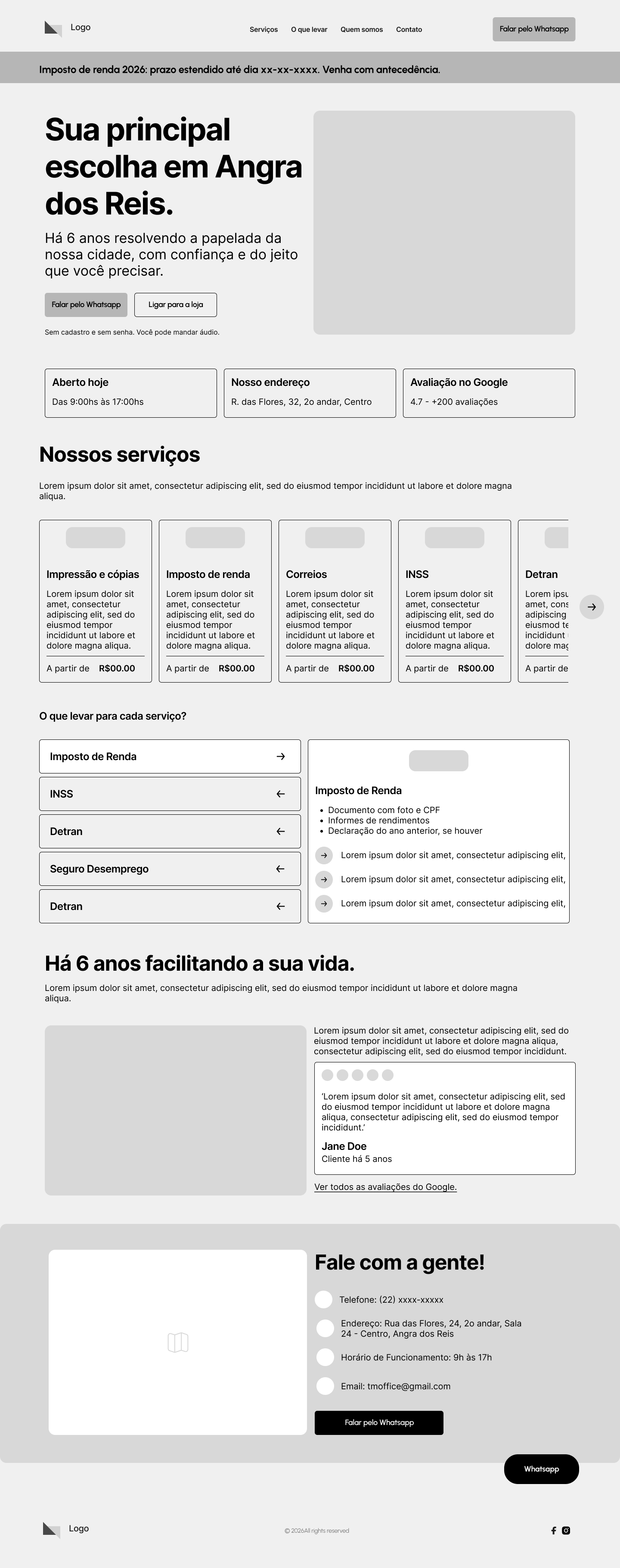
After creating initial sketches, I developed mid-fidelity wireframes to define the landing page structure and information hierarchy before moving on to the visual design.
TM Escritório Virtual
Scroll ↓
Scroll inside the window to explore the whole page.Open full size
I then created an interactive prototype and tested it with the client and two customers. Participants were asked to complete simple tasks, such as:
Which documents do you need for postal services?
Where can you find the business’s phone number?
How can you contact the shop through WhatsApp?
Where can you find the price of document copying?
These tests helped me observe how users navigated the page, which elements they noticed or overlooked, and whether any content was confusing. The insights gathered helped identify usability issues early in the process and informed decisions to make the experience clearer, more intuitive, and easier to navigate.
Problems and opportunities found in the previous iteration
Prominent practical information
Opening hours, address, phone number, and customer reviews should be visible without requiring visitors to scroll to the footer. This reduces the effort needed to determine whether the business is accessible and trustworthy.
The service carousel hides information
The carousel uses a scrollbar and navigation arrows, requiring users to realize that additional items exist outside the visible area. For this audience, prioritizing immediate discoverability is a better approach.
Accessibility
Use legible text, left-aligned content, short paragraphs, generous spacing, and everyday language.
Prototyping
Moving to Hi-Fi Prototypes
Starting from the validated mid-fi designs, the chosen color palette, and all the insights gathered, I moved on to the hi-fi prototypes. The client’s only aesthetic requirement was that the landing page be pink.
TM Escritório Virtual
Scroll ↓
Scroll inside the window to explore the whole page.Open full size
Throughout this process, the personas created for this project were constantly taken into account. Maria guided my UI decisions (font size, contrast, large buttons, simple language, WhatsApp as a priority), and Rosangela guided my content and credibility decisions (objective information, social proof, and a presence on Google).
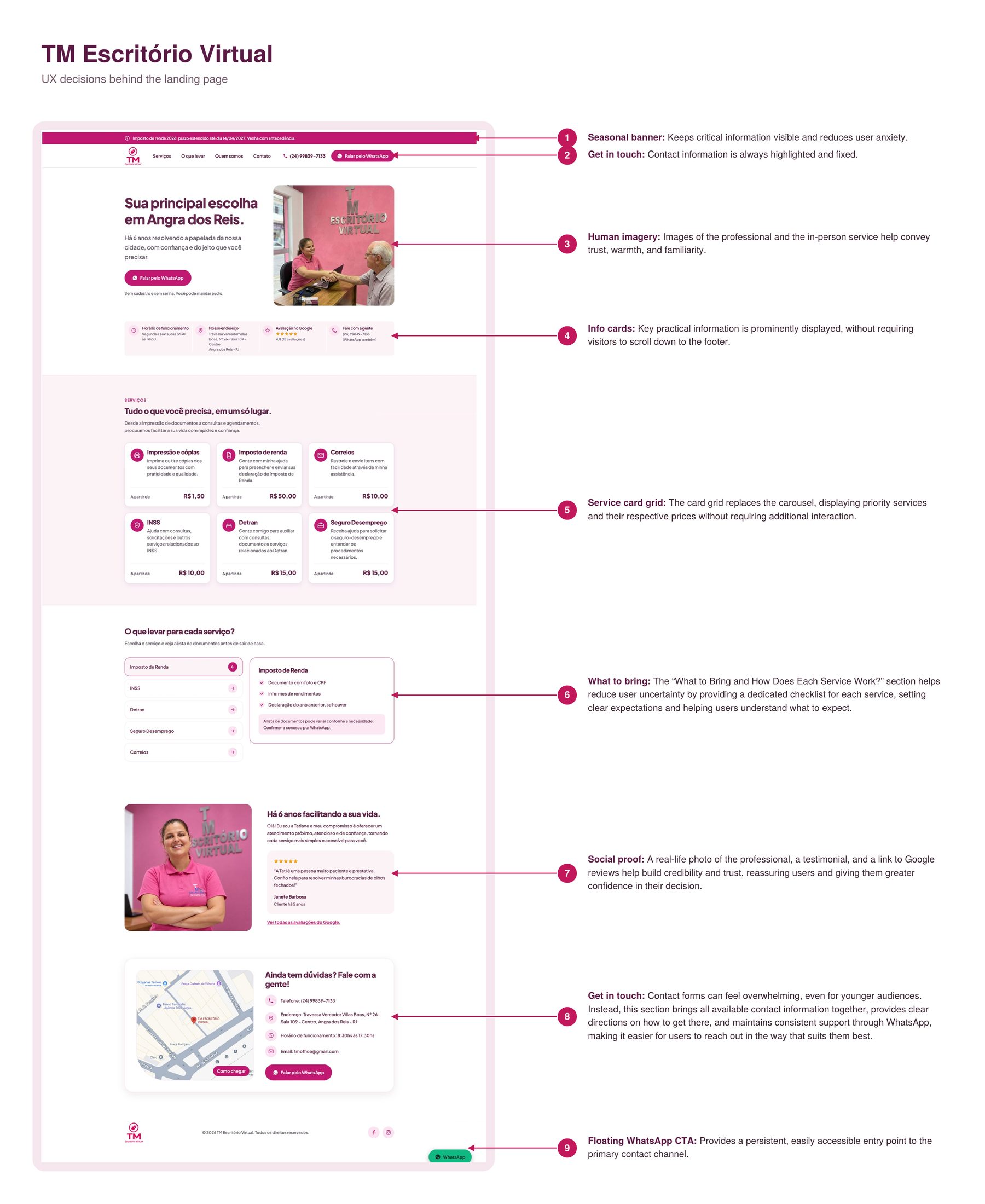
UX decisions behind the landing page
Click an image to zoom in.
Outcome
Next Steps
The next step is to implement and launch the landing page. Once live, I plan to monitor key metrics, including WhatsApp CTA clicks, to evaluate how effectively the website encourages users to contact TM Escritório Virtual and learn more about their services.
I will also gather feedback from users to identify opportunities for improvement and ensure the experience remains accessible, intuitive, and aligned with users’ needs.
Feedback
Client Testimonial
Working with Isa helped me understand the value of having an online presence for my business. The landing page makes it easier for people to discover my services and find the information they need. I’m very happy with the result and grateful for her attention to detail and dedication throughout the project.